


 Search

 Call: 074-2915208
Preview Qlik Release February 2019
As a foretaste of the Qlik Release February 2019 introduces Qlik 7 new layouts for dashboards.
This update is based on the same dashboard bundle that was already released in November 2018. The most popular and useful visualizations from the open source community Qlik Branch are through Qlik inherited and put into one package that the user can choose during installation. Two of the extensions (Funnel and Sankey) were made by Qlik and the others were created by individual developers: Clever Anjos (Word cloud), Alexander Nerush (Multi KPI), Ralf Becher (Heatmap), Brian Booden and Matthieu Burel (Radar) and Michael Laenen (network).
The extension pack is an add-on, is open source, and has different terms and conditions than the rest of it Qlik Sense product. The objects are supported by Qlik and are fully functional. However, they are limited compared to standard charts for certain aspects, such as accessibility and right-to-left reading. The feedback so far has been great: users like the easy way to add the new maps and the support for version upgrades.

Funnel chart
The funnel chart most closely resembles vertical descending bar charts with sloped sides. Four rendering modes are supported, with the value proportional to the range of each segment: area, height, width or habit. The measurement always ends, so no sorting option is required. The funnel chart is popular in sales and marketing related analysis and is often used to represent stages in a sales process.

Sankey Chart
The Sankey diagram is a kind of flow chart, in which the width of the arrows is shown proportional to the flow amount. The example shows a breakdown of sales by product category by country. Sankey diagrams provide a visual emphasis on the major transfers or flows within a system. They are helpful in locating dominant contributions to an overall flow. Sankey maps were first used in physics to show energy efficiency breakdown, but are popular today in web traffic analysis, traffic flows, and many other applications.
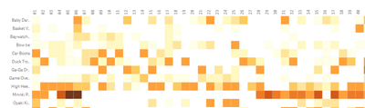
Temperature chart
The Heatmap chart is a data table that shows the individual values in a matrix as colors. Larger values were represented by dark squares and smaller values by lighter squares. A heatmap is useful to quickly provide an overview of many values over two dimensions, outliers are easy to recognize, much faster than just numbers in a table. A similar effect can be achieved by using an expression for the background color of the straight table and pivot table, but in the heatmap map you can use the lasso to make a selection in two dimensions at the same time.

Radar chart
The radar chart shows data from three or more variables displayed on axes in a polar map, starting from the same point. All axes have the same scale, in this example the product category serves as the main dimension. The second dimension, the axis, represents KPIs with the same scale. The radar chart is often used to show comparisons and outliers. A popular use case is to compare functions, for example with consumer electronic devices. With many dimension values, the chart fills up and it is often more practical to display multiple charts side by side.

Multi-KPI
The Multi KPI object offers a range of options and adjustments that go beyond the standard KPI object. You can use fonts with size, position and color, multiple KPIs with dimension or measures, embed thumbnails using master visualizations and style with CSS and icons to get the message through. Presenting KPIs is a great way to summarize information and looks great in any dashboard or application.

Word cloud
The Word cloud is a visual representation of text data. Tags are usually single words and the importance of each tag is shown with font size or color depending on a size. In text analysis that would be the frequency of the word, but any expression can be used. Font size limits, color gradients and number of text directions are possible to set in the Word cloud. Word clouds come from text analysis, but look great with any nominal data as long as the strings of the values are not too long.
Network Chart
The network chart is a graphical representation of the links and nodes of a chart. The network diagram is probably the most demanding graph when it comes to the indata. The chart requires the data model to be a correct chart description. The following measurements are necessary:
- Node id, it must be numeric, unique, start at 0 and consecutively 0, 1, 2 ...
- Node label
- Parent ID, which should point to the Node ID
- Node group
After that, measures can be added for tooltip, node and link size. The network map is useful for analyzing relationships between entities. Popular use cases for network diagrams are organizational structures, bills of materials, computer network topologies just to name a few.
Looking to the future ...
What's next? The bundle program has been hugely successful and will continue with improvements in the release of Qlik Sense April 2019. The content of that release has yet to be determined, so keep an eye out for updates!