The September releases of Qlik have been released! So it is Qlik Sense, the data visualization and analysis platform with new functionalities and improvements.
First of all, some subtle changes to the user interface that are not even noticeable at first glance.
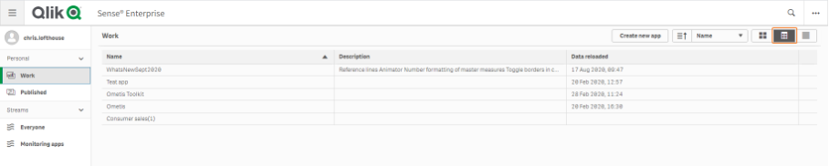
- A new table-layout view is available in the Hub, allowing Qlik Sense apps are clearly presented in a table. The app name, description and last reload date are visible here. For published apps, the owner and date / time of publication are also visible. The columns can be sorted by clicking on the headers of the table.
- The orange highlight color has been changed to green in the September release. This means that selected and active buttons and selected objects in the sheet editor now have a green border.
- The option to disable hover icons. Available in the app options to disable the menu for the entire app or at the object level under Appearance -> General

- The explanations and descriptions visible during visualization creation have been improved to provide a better experience for users

Renewed visualizations
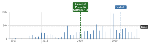
Improved reference lines
It is now possible to add reference lines based on the dimension in line and bar charts. Useful for showing influential events along a time-based dimension or for adding attention to a dimension value.
In both dimension and measure-based reference lines, formatting options have been added that make it possible to show only the label or value or even neither. Adding context to visualizations has never been easier.
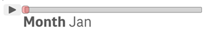
 Animate your data
The Animator object that was already known from the Qlik GeoAnalytics bundle is now available in Qlik Sense. Walk through the different values in a dimension or let the story behind the data unfold like a movie. Click play and watch your visualizations change from day to day or month to month or use the slider to easily and quickly choose one value.
 Other functionality in visualizations
- Frequency counter in Filter boxes. Show the frequency in Filter boxes. Both relative and absolute values are available.
- Edges of container objects can be staked.
- Better sorting options in Sankey charts
- Tooltip now also available in Bullet charts
Number format in master Measurements
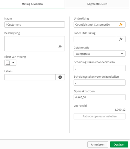
Last but not least, from the September 2020 release it is possible to record the number format per measurement in the Master items. The usual formats (Number, Money, Date, Duration) are available, in addition to the option to manually enter a custom format. At object level, the number format can be overwritten if the format needs to be different.
 Qlik Elite Solutions Provider
Victa is a certified Qlik Elite Solution Provider. We offer you a complete range of Qlik professional services: Qlik-software, Qlik consulting, Qlik training and Qlik helpdesk. This gives you as a customer all disciplines and services related to Qlik from one supplier.
Qlik Elite Solutions Provider
Victa is a certified Qlik Elite Solution Provider. We offer you a complete range of Qlik professional services: Qlik-software, Qlik consulting, Qlik training and Qlik helpdesk. This gives you as a customer all disciplines and services related to Qlik from one supplier.
 Victa for Good
View the overview of the charities that Victa supports and with which there is already a collaboration. We invite visitors to our website to also actively contribute to these noble agencies and charities. Give today!
Victa for Good
View the overview of the charities that Victa supports and with which there is already a collaboration. We invite visitors to our website to also actively contribute to these noble agencies and charities. Give today!

 Search

 Call: 074-2915208